REPLY FORWARD
Shifting the American political conversation toward the future.
Context
Master's Thesis (MFA in Products of Design).
Project advisor: Emilie Baltz
The Reply Forward movement seeks to shift the political conversation in America toward the future and invite more voices to join. On March 23rd, I brought Reply Forward out to Washington Square Park in New York City—a historic location for political activism.
Reply Forward was the public engagement component of my thesis.
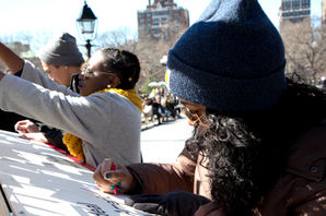
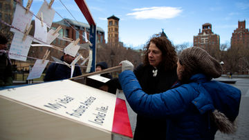
We had around 200 people engage with us in some sort of way over the course of the five hours we were outside, whether it was pausing to examine the postcards on the clotheslines, chatting with me or my volunteers, or stopping to write and add their own.
OUTCOMES
We also encouraged participants to take postcards home to send on their own time.

PLANNING
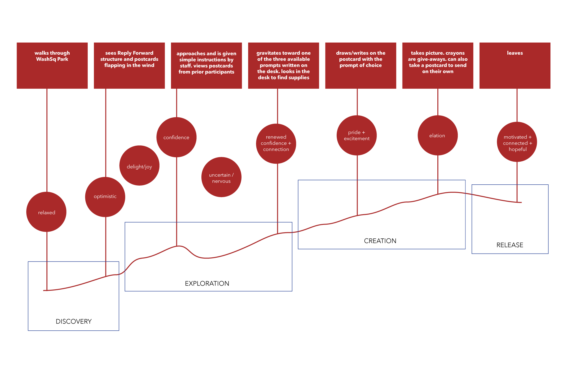
User Journey Map

Reply Forward aimed for three main takeaways:
-
A sense that there is a future.
-
Our individual and collective voices matter in building it.
-
We can share it with each other.
In planning the experience, I stayed attuned to the transitions: moments between and surrounding the individual touchpoints of the experience. Planning for these moments by designing additional graphic, physical, or experiential elements allowed the experience to flow smoothly on the day of the event.
These elements included things as simple as branded name tags for my nine volunteers, and as complex as using TV wall mounts to make the physical elements easy to assemble and disassemble.
THE STRUCTURE


THE GRAPHICS
Replying typically involves responding to a received message, while forwarding means passing the message along to others. Placing these two actions side-by-side reveals the goal of the movement as well as the direction. Combining the iconography of replying and forwarding yields the red reply arrow, flipped to face the same direction as the forwarding arrow.
The typography also seeks to harmoniously match retro and modern, pairing the serif typeface Athelas with the contemporary sans-serif Avenir Next. Athelas carries the dignity of the movement as the header typeface, while Avenir Next makes it approachable and fun as the body.


With these elements, I designed invitation covers for Instagram, Facebook, and Eventbrite to be reminiscent of postcards and other mail.
I also designed stickers to brand the packaging of the small boxes of crayons I provided for writing on the postcards. The crayons were chosen to lower the barriers to creativity for participants, prevent people from writing essays, and to give away at the end of the activity.

Because Reply Forward is a movement, I knew it needed to have a website. I claimed the .org domain and built a website through Squarespace to invite participants to stay in touch after the event. Check out ReplyForward.org to see it!

The Reply Forward brand references both modern icons used in email communication and classic symbols of postal communication by marrying the red arrow with the postage stamp. The arrow, and the name of the movement, are derived from two standard email correspondence actions: replying and forwarding.
POSTCARDS & POSTSCRIPT
The installation attracted participants who were citizens, non-citizens, immigrants, visitors, right-wing, left-wing, young, and old. Below is a selection of the 177 postcards that my volunteers and I collected from the event.
I have a million thank yous for this project:
To Emilie Baltz for advising and encouraging.
To my nine volunteers, for serving as event staff and camera crew: John Boran, Stephanie Gamble, Bart Haney, Seona Joung, Shin Young Park, Catherine Stoddard, Yufei Wang, Sherry Wu, and Elvis Yang.
To Nick Smith, Carly Simmons, and the VFL staff for helping with the production.
To Yangying Ye for brilliantly realizing that we can have a relationship around a U-Haul truck.
To the SVA Alumni Society for believing in the impact of this project.


